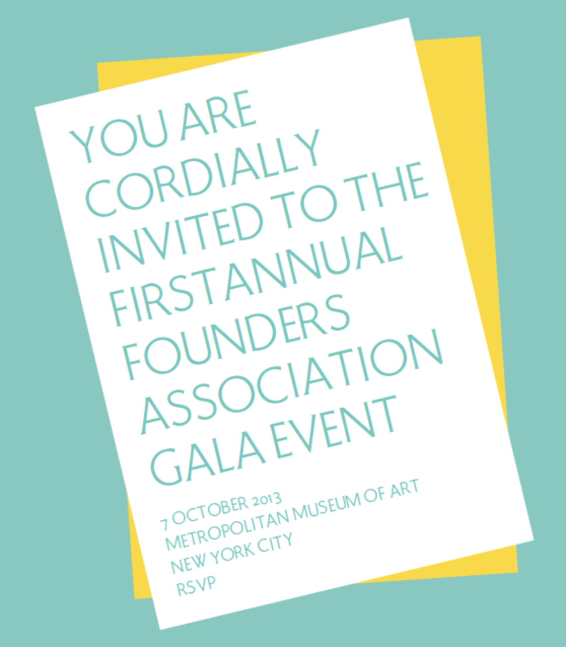
Hammond Typeface Family
Hammond is a display typeface inspired by Roman capital proportions and the Art Nouveau interest in natural forms, curves and poetry in everyday life.
With a low-contrast stroke width, small tapering serifs, and finely tuned detail angles, a distinctiv voice is given any set of words in Hammond. With a wide range of ligatures and idiosyncratic alternate glyphs, distinctive typesetting creates unique contexts for content.
Optimal for use in display settings such as book covers, editorial identity, magazine head/decks, and for any short text for casual reading.

Typeface designed and drawn by Lisa Maione. Hammond Display (shown) available upon individual inquiry.
Bold, Small Caps and Italic weights in development.
Gratitude to Hans and Just.
Bold, Small Caps and Italic weights in development.
Gratitude to Hans and Just.